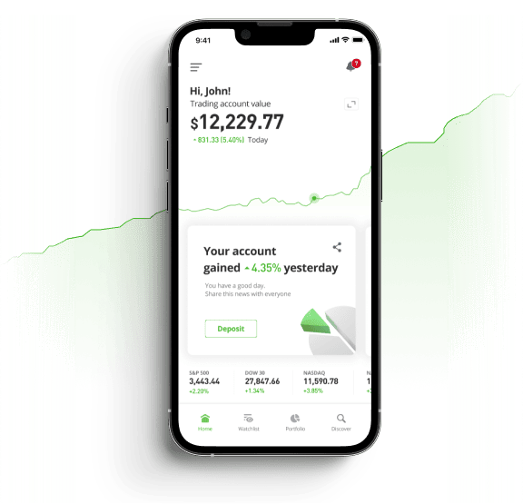
Trading support and resistance lines is more profitable if these levels are treated as price zones.
One of the most commonly used theories in trading currencies, commodities and stocks is trading the support and resistance lines. If we take a look at the diagram below we see that the market is moving down, a bear market. When the market moves down it meets support and then moves up. The peak of the pullback is now resistance. As the market continues down, the lowest point before it starts up again is now becomes support. As market prices move up and down so the support and resistance levels are formed over time.

Trading Support and Resistance:
Don’t expect prices to bounce upward the moment they hit a support level or drop down when they hit a resistance level, this rarely happens. The prices will break these lines as they ‘test’ the levels and that ‘testing’ is usually characterized by candlestick shadows.

As we see from the chart above there are several instances where there was a support level at 1.4478-40. The price eventually broke through at point A where it fell and then rose again to test where the previous support has become resistance at around the 1.4480 price level before dropping back to a new support level around 1.4460. The price again tests resistance at 1.4480 before falling back a little before it tests the resistance level again and successfully breaks through to move higher.
As you can see from the chart it would be difficult for a trader to know if the support or the resistance was truly broken. Certainly at the point where the price broke through the support level at ‘A’ and a trader felt that it would rebound and opened a long position, the trader would have been very wrong and lost money. Whatever the time frame it is wiser to wait for the market to close and then decide if support or resistance has been broken.
Many argue that it is better to treat the support and resistance levels as zones rather than specific price levels. These zones can be plotted more accurately on a line chart which shows the closing price only, rather than on a candlestick chart which has confusing shadows. If we take the example chart above and change it to a line chart and plot some support and resistance zones (green rectangles) on the peaks and valleys it is easier to see where price support and resistance are located.

By plotting the support and resistance levels this way the false breakout signals are filtered out and the trader does not get pulled into a losing trade.
How to interpret support and resistance lines and apply the data for a possible trade?
If we look at the GBP/USD 60 minute chart below we can see that there are three support zones and two resistance zones. An experienced GBP/USD trader would probably have closed out a long position at the 2nd resistance zone and closed out a short position at the support zone on 2nd June.

In conclusion, the key to trading the support and resistance levels is the recognition that these levels are not specific prices levels but that they are price zones.

Are you using social indicators to make your investment decisions? Social indicators are based on real trades made by thousands of different traders. eToro Openbook is the largest social trading network and provides you with live trading information to better form your investment decisions. Visit eToro Openbook and start using social indicators today!